This is Pleo (2.0)

Don’t miss an article.
The world of work is evolving. We think Pleo has a big part to play in shaping that.
You know what else is always evolving? Our product.
So, the time’s come for our identity to evolve too.
Out with (most of) the old
We’ve gone away to dream it all up again and over the next little while, you’re going to notice some changes.
Our app, the Pleo homepage, the delightful illustrations on this very page. The way we look and sound is going to have a new direction and a sharper focus.
But do not panic (as if you would) – your Pleo card works just the same .
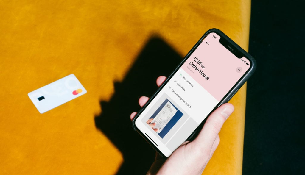
Use it to buy what you need for work and snap the receipt when you get a notification on your phone. It’s still that simple.
So what’s the thinking behind these changes? Glad you asked.
Why now?
If there was a prize for stating the obvious, they’d be engraving our name on the trophy after this next sentence, but here goes:
Pleo has changed a lot since we started.
From humble beginnings, our cards have now empowered thousands of people at companies across Europe.
We’ve developed fast. Our brand needed to catch up.
Our team has grown exponentially, building a product and business of which we’re all proud. Pleo is also available in an increasing number of countries.
But all of that growth meant our branding was struggling to keep up.
Our visual identity didn’t feel like it reflected our ambition and mission. “Pleo pink” was fun, but felt a little – how can we say this – start-upy .
It was time to hit the Refresh button.
Digging deep
In order to go forward, we had to go backwards. Dig into some foundational Pleo stuff.
To do that, we felt the need for some external support.
A branding agency that could not only help steer the discovery process, but drive the eventual identity execution – and, sometimes, act as referee if things got heated during our internal strategy workshops.
And who better than Koto?
An agency based in London, Berlin and LA, they’ve worked with some seriously big hitters . But it wasn’t just their former brand identity work that wowed us.
Very quickly, we realised that they got Pleo – the ease of use of our product and the mission we are on (which, if you forgot, is all about encouraging transparency and trust in a business ).
The cherry on top? Koto were already card-carrying Pleo customers.
Let’s go to work
So, we got stuck into workshops, immersion interviews and a whole bunch of mood boards.
Asking questions, big and small.
(What celebrity is Pleo most like?)
Not surprisingly, that process made us appreciate a lot of the things that matter to us. Like our sense of fun.
We don’t want to offer the usual stuff you get from finance companies.
We’ve never been afraid to be playful in our style – just take a look at some of our vital and vibrant artwork. Or read back over the bad jokes sprinkled throughout our blog.
Our aim was always to speak in a way that was transparent and humble.
Not the usual stuff you get from finance companies. So we want to keep a hold of some key elements of the Pleo identity and just do it… better.
Where we are today
Some aspects of our new brand identity will take a little while to sink in…
… but others, like our logo, will be obvious right away.
We want to be the go-to spending solution for forward-thinking teams everywhere.
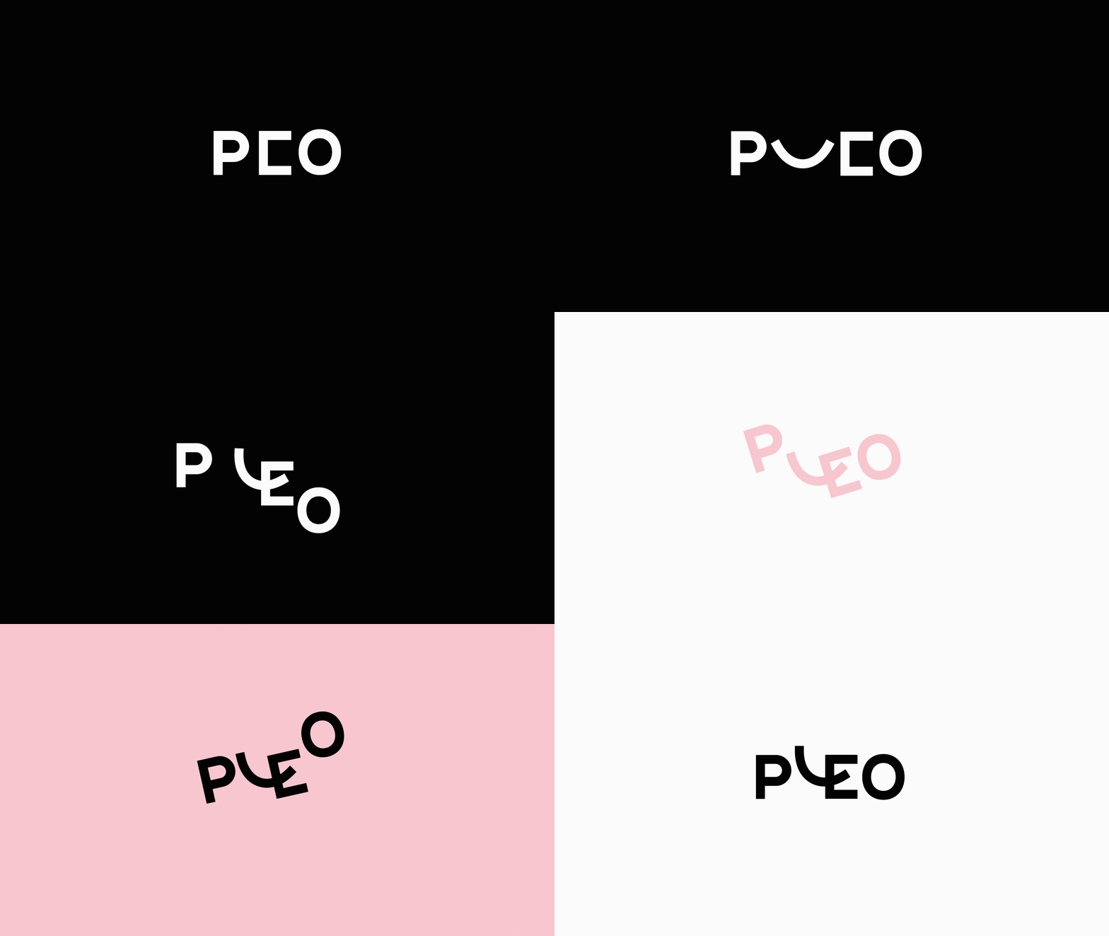
A logo that’s confident and warm plays a big part in forming first impressions of Pleo.
We’ve even identified the easiest way to help everyone pronounce Pleo.
We’re still bringing that beautiful, bold Nordic simplicity with our new design.
But now we’re also reflecting more of the Pleo positivity and moxie with that cheeky little smiling L.
A new visual identity doesn’t stop there though. Our illustration style. The fonts you see when you land on our homepage. Which words should go where on our events stands.
It’s all been up for debate. Maybe that’s why we’re so proud of where we’ve ended up.
We even identified the easiest way to help everyone pronounce our name – it rhymes with Rio, because of course it does.
Where we’re going
Look, Pleo is growing up.
We’re now guided by one big idea – that Pleo means “power to your people”.
Cool, right?
Power for your team to make their own decision about what they need to buy.
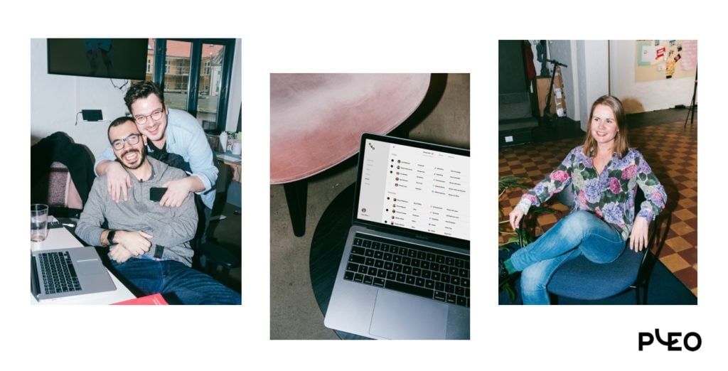
And hey, power for us to have fun as we try on our new look. In the next few weeks, a few things might be fine-tuned and finessed. But, right now, look how happy we are!
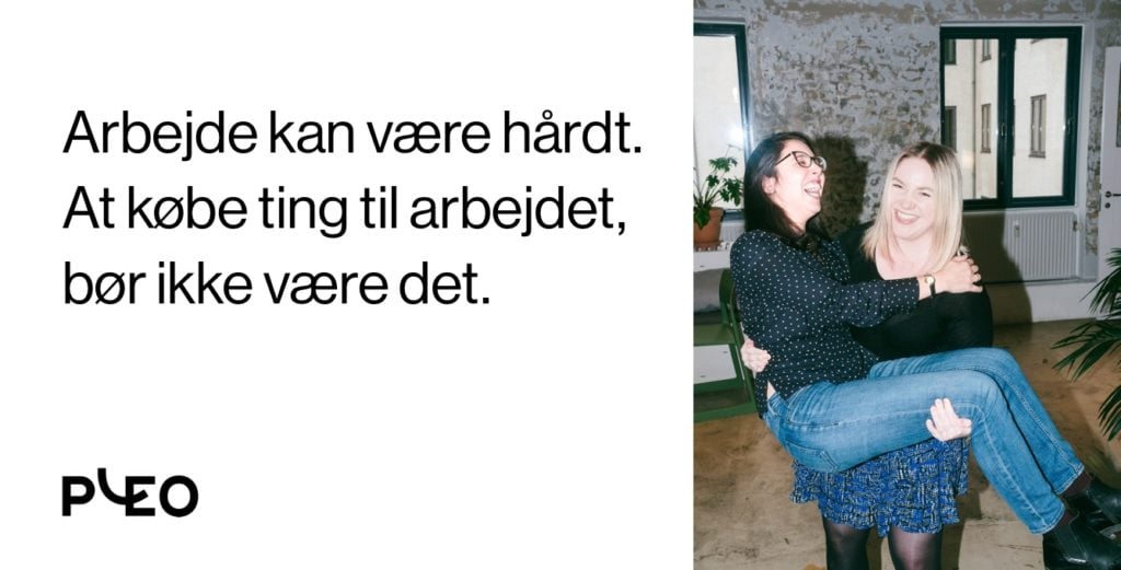
Then, what can you expect? Well, OK, that Super Bowl ad is still a few years out.
But don’t be surprised (be delighted!) if you see Pleo splashed about on a billboard on your way to work.
Or featured in a TV ad that’s simply too-good-to-switch-over.